Content switcher
Design annotations are needed for specific instances shown below, but for the standard content switcher component, Carbon already incorporates accessibility.
What Carbon provides
Carbon bakes keyboard operation into its components, improving the experience of blind users and others who operate via the keyboard. Carbon incorporates many other accessibility considerations, some of which are described below.
Keyboard interactions
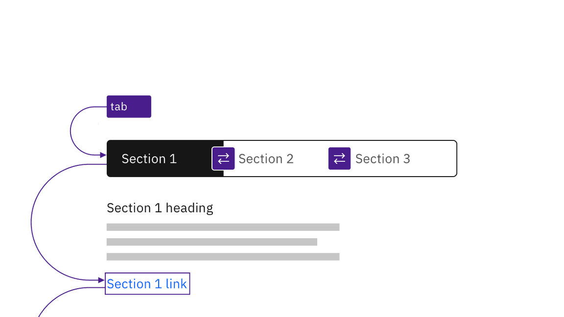
Like tabs, content switchers can be automatic or manual. In both instances, the content switcher takes one tab stop, and arrow keys are used to navigate between content tabs.

Manual and automatic content switchers have the same basic keyboard interaction.
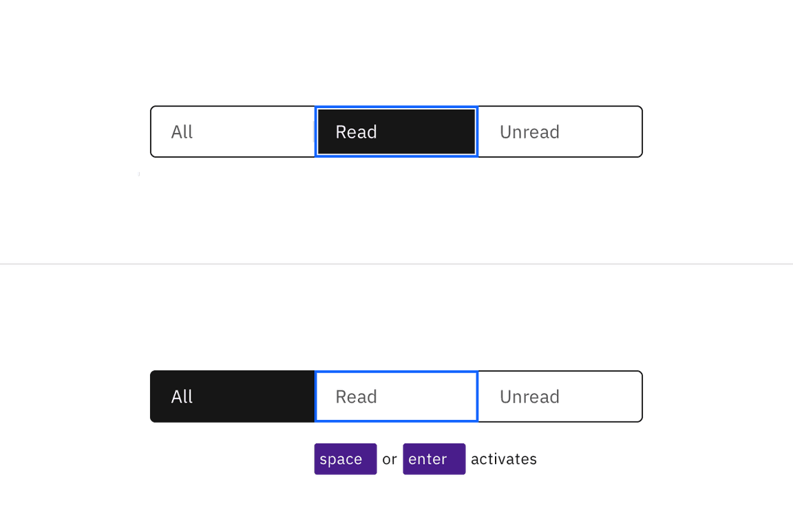
Automatic and manual switchers differ in how they are activated. The following illustration shows what will happen for each variant when a right arrow key is pressed with the All content tab selected and focused.
For automatic switchers, focus and selection are synchronized. When the user arrows to a tab, it is selected and the content section under the switcher is updated in real time.
Manual switchers allow the user to arrow between the content tabs without
updating the content section underneath. When the user right arrows, the All
content tab remains selected while focus moves to the Read tab. In order to
select the Read tab (and update the content section under the switcher) the user
would press Enter or Space.

Arrows keys alone update the selected tab in an automatic content switcher. The Space and Enter keys are used to select a content tab after arrowing to it in a manual variant.
Design recommendations
Indicate which variant to implement
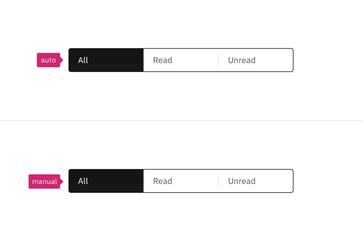
The automatic and manual switchers are visually indistinguishable in a wireframe, so designers should annotate which variant the team has decided to implement. Since the choice largely concerns technical considerations about potential latency when updating the content section’s information, architects or developers should be involved in the discussion.

Annotate whether the switcher should be implemented as automatic or manual.
Development considerations
Keep these considerations in mind if you are modifying Carbon or creating a custom component.
- The Content switcher is implemented as a
tablist, with each content tab implemented as a<button>with a role oftab. - The selected content tab has attributes
aria-selected="true"andtabindex="0". All other tabs have these attribute values set to"false"and"-1". - See the ARIA authoring practices guidance for tabs for more considerations.
- For accessibility considerations for manual content switchers, see Deciding when to make selection automatically follow focus.